299 Car Paint Job Ideas and Style Inspiration
Choosing a car paint job is rarely just about color, because finish, contrast, and surface behavior can change how every line of the body is perceived. A compact hatchback can look upscale, playful, or aggressively sporty depending on the treatment it wears. This guide organizes 299 ideas into clear groups so inspiration feels useful instead of overwhelming. Read on if you want style, context, and practical direction in one place.
Outline and Strategy: How to Navigate 299 Car Paint Job Ideas
A good paint job does two things at once: it protects the surface and tells a visual story before the engine even starts. That is why browsing paint inspiration can feel thrilling for ten minutes and exhausting after an hour. One photo suggests modern luxury, another shouts vintage race car, and a third makes you suddenly consider bronze wheels, a black roof, and a deep green finish you had never imagined. To make the topic usable, this article groups 299 paint job ideas into a practical framework rather than a random gallery.
Here is the working outline for the full list of 299 inspirations:
- 75 classic solid-color and gloss ideas built around timeless appeal
- 84 metallic, pearl, candy, matte, and satin concepts focused on finish effects
- 70 stripe, two-tone, retro, and graphic designs for stronger personality
- 70 decision-based combinations shaped by body style, climate, budget, and care needs
This structure matters because a paint choice should be filtered through more than taste alone. A large SUV can carry a dark metallic color with authority, but the same finish on a small commuter car may feel heavier than intended. A bright candy finish may look stunning at sunset yet demand more careful repair work later. Matte paint can create a stealthy, modern appearance, but owners need to know that conventional polishing can alter the sheen. In other words, style and upkeep are not rivals; they are partners.
Another useful rule is to judge paint in context. Consider the car’s body lines, wheel design, trim finish, and intended use. Weekend cruiser, family crossover, classic restoration, track toy, work truck, and urban daily driver all invite different answers. Body preparation also deserves a mention, because even the most beautiful color struggles to hide poor panel work. Professionals often say the result is only as good as the surface underneath, and that is not an empty cliché. Straight panels, careful sanding, and a clean clear coat make ordinary colors look expensive.
Think of the sections ahead as a design map. Some readers will want the quiet confidence of factory-plus elegance. Others will want a paint job that enters a parking lot like a guitar riff. Both approaches can work brilliantly when the choice respects proportion, purpose, and maintenance reality.
Classic Colors and Timeless Factory-Plus Looks: 75 Ideas That Age Well
If your goal is a paint job that still feels attractive five or ten years from now, classic colors are the safest and often smartest place to start. “Classic” does not mean boring. It means the color works with a wide range of shapes, trim packages, wheel finishes, and lighting conditions. These 75 ideas include variations of white, black, silver, gray, red, blue, green, beige, bronze, and other familiar tones, each adjusted through warmth, depth, and gloss level to create a distinct personality.
Take white, for example. On one car it looks clean and minimal, almost architectural. On another, especially with black trim and dark wheels, it becomes sharp and modern. Black is equally powerful but more demanding. A black paint job can make curves look deeper and reflections richer, yet it also reveals dust, swirl marks, and minor scratches faster than lighter colors. Silver and medium gray remain popular for a reason: they flatter many body shapes, hide everyday grime better than black, and usually support strong resale appeal in the used market.
Red deserves its own mention because it spans multiple moods. Bright solid red feels playful and sporty. A darker burgundy or wine red leans more mature and luxurious. Blue is one of the most versatile families of all, with navy projecting restraint, vivid electric blue feeling energetic, and muted slate blue offering something more design-led and less predictable. Green, once overlooked in many modern lineups, has made a quiet comeback through shades like British racing green, olive, forest, and even gray-green tones that pair beautifully with bronze or silver wheels.
- White and ivory suit modern sedans, fleet builds, and clean street customs
- Black and charcoal amplify luxury but require careful washing habits
- Silver, graphite, and gun gray balance style with low visual fuss
- Red, navy, and deep green offer classic personality without becoming gimmicky
The most successful factory-plus paint jobs also pay attention to undertones. A warm gray can look elegant beside brushed aluminum trim, while a cooler gray feels more technical and contemporary. Cream, champagne, and light beige can transform older coupes and luxury cars, especially when paired with tasteful chrome. Even brown, when handled as a rich mocha or metallic cocoa, can look sophisticated rather than dated.
For many owners, the smartest inspiration is not the loudest one. A timeless color with excellent preparation, crisp panel alignment, and the right wheel finish often turns more heads than a wild idea executed poorly. Subtlety has a strange advantage: it rarely begs for approval, yet it tends to earn it.
Metallic, Pearl, Candy, Matte, and Satin Finishes: 84 Ideas Built on Surface Drama
Once you move beyond traditional gloss solids, the personality of a paint job changes dramatically. Finish effects do not just add shine; they alter how light travels across the body. That is why two cars painted in similar shades can look entirely different in motion, in sunlight, or under street lamps. These 84 ideas cover metallic, pearl, candy, matte, and satin approaches, and each one brings its own strengths, challenges, and visual language.
Metallic paint uses tiny reflective particles to create sparkle and depth. On modern vehicles, metallic silver, steel blue, copper, and graphite are common because they make contours easier to read without appearing overly flashy. Pearl paint goes a step further by using special pigments that shift tone depending on angle and lighting. White pearl can look almost creamy in warm light and icy in shade. A deep purple pearl may appear black at night, then reveal violet edges in the sun. That hidden complexity is what gives pearl finishes their premium reputation.
Candy finishes are among the most dramatic. They typically layer a translucent color over a reflective base, which creates a rich, almost liquid appearance. Candy apple red, cobalt blue, and root-beer brown remain favorites in custom culture because they seem to glow from within. The trade-off is cost and repair difficulty. Multi-stage finishes often require more labor, careful application, and more precise blending if a panel is damaged later. The look can be unforgettable, but it is rarely the low-maintenance route.
Matte and satin finishes work differently. Instead of emphasizing reflection, they control it. Matte absorbs light and gives the surface a flat, stealthy attitude. Satin introduces a soft sheen, often making it easier to live with while preserving that modern custom feel. These finishes are especially popular on performance builds, off-road trucks, and restomod projects, but they require an owner to understand the care routine. Unlike gloss paint, matte surfaces generally cannot be polished in the usual way without changing the appearance. That single fact should shape the decision.
- Metallic is ideal for daily drivers that need depth without excessive upkeep
- Pearl adds premium visual movement and works well on luxury or show-focused builds
- Candy delivers maximum drama but usually increases cost and repair complexity
- Matte and satin create a strong mood, yet demand finish-specific cleaning habits
Color choice interacts with finish choice in important ways. A satin olive green feels tactical and rugged. The same shade in high-gloss pearl can look upscale and almost exotic. Bronze metallic suits trucks and sport sedans alike, while icy pearl white can make a crossover seem more premium than its price point suggests. Midnight blue metallic on a coupe may feel refined by day and mysterious by night, like the car is changing outfits between errands and evening drives.
When people say a paint job has presence, this is usually what they mean. The finish has turned the sheet metal into something alive with movement. It is not only color anymore; it is atmosphere.
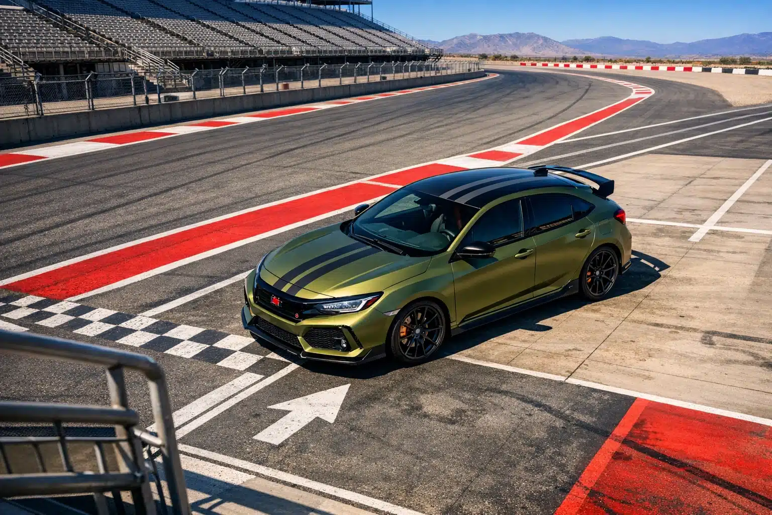
Stripes, Two-Tones, Retro Themes, and Custom Graphics: 70 Bold Ways to Add Character
Some cars look best when the paint stays quiet. Others are improved the moment you give them a graphic idea to carry. This category covers 70 inspirations based on stripes, two-tone layouts, racing cues, period details, roof contrasts, ghost graphics, and other visual devices that add identity without requiring an entirely unusual color. Done well, these treatments can make a familiar car feel memorable. Done carelessly, they can break the body into awkward pieces. Proportion is everything.
Racing stripes remain one of the simplest and most effective options. A pair of center stripes on a coupe or muscle car instantly suggests speed and heritage, even when the vehicle is parked. Narrow stripes tend to look modern and restrained, while wider stripes feel more classic and theatrical. Side stripes can lengthen a car visually and work especially well on hot hatches, vintage sedans, and performance trucks. Pinstriping offers a subtler path, tracing body lines or separating two colors with a handcrafted feel.
Two-tone paint is another rich field of inspiration. A black roof over a lighter body can make a car appear lower and sleeker. A cream upper section over a deep green lower body evokes mid-century elegance. Trucks and SUVs often carry two-tone schemes well because the height of the body gives the color break room to breathe. On classic restorations, a properly chosen two-tone finish can highlight chrome trim and recreate period charm without looking costume-like.
- Center stripes suit coupes, roadsters, and heritage-inspired performance builds
- Lower-body accents can visually reduce bulk on tall SUVs and trucks
- Contrasting roofs help modern hatchbacks and crossovers look sharper
- Ghost graphics add detail that appears only in certain lighting conditions
Retro themes draw from specific eras. Think of 1960s scallops, 1970s earthy metallic combinations, 1980s angular graphics, or 1990s tuner-style fades and accent bands. These can be fun, but success depends on matching the era to the car’s architecture. A restomod muscle car can wear heritage striping naturally. A modern EV may benefit more from geometric contrast or a satin roof rather than nostalgic flames. Custom graphics should respect the body instead of fighting it.
A useful design test is to step back and imagine the car from fifty feet away. Does the graphic strengthen the silhouette or interrupt it? The best paint graphics guide the eye across the shape, almost like a visual melody. You notice the rhythm first, then the detail. That is why restrained creativity often outperforms maximum effort. One elegant stripe, one contrasting roof, or one smart lower accent can say more than a dozen loud ideas stacked together.
For owners who want personality without abandoning practicality, graphics offer a middle road. You can keep a proven base color and still create something unmistakably yours. Sometimes the difference between ordinary and memorable is only a line wide enough to catch the light.
Choosing the Right Paint Job for Your Car: Budget, Maintenance, and Final Takeaways
After the inspiration comes the harder part: choosing a direction that fits the car you own and the life it actually lives. This is where the final 70 idea paths become useful. Instead of starting from color alone, start from conditions. Is the car parked outdoors all year? Does it see highway miles, gravel roads, automatic car washes, or occasional shows? Is resale important, or is this a long-term personal project? A brilliant paint job is not the one that looks best in one photograph; it is the one that still feels right after six months of ownership.
Budget matters, and not just the number on the estimate. Paint cost is shaped by preparation, disassembly, material choice, body repair, and finish complexity. A simpler single-color repaint may look excellent when the body is straight and the prep work is thorough. A multi-stage custom finish with pearl or candy effects can cost substantially more because it demands additional materials, more labor time, and greater skill in spraying and blending. If you are comparing quotes, always ask what is included. Trim removal, jamb painting, rust repair, and clear-coat quality affect the final result as much as the color itself.
- Daily drivers usually benefit from durable, repair-friendly gloss finishes
- Show cars can justify pearls, candies, and detailed graphics because visual impact matters most
- Work trucks and adventure builds often suit satin, darker earth tones, or easy-care metallics
- Resale-focused owners are generally safer with timeless colors and cleaner designs
Maintenance should guide the decision just as much as taste. Dark glossy colors show dust and swirl marks quickly. Matte finishes require specialty-safe products and careful washing methods. Pearl and candy finishes can be harder to match after damage. Lighter metallics often hide everyday wear more gracefully. Climate also matters. Strong UV exposure can punish neglected clear coat, while winter road salt makes proper sealing and washing habits even more important. The smartest paint job is one you are realistically willing to maintain.
If you still feel stuck, create a shortlist of three directions only: one safe option, one expressive option, and one balanced option. Look at each choice beside wheel colors, trim, interior tones, and the places the car will spend most of its time. A glossy navy, a satin olive, and a pearl white may each be beautiful, but only one will usually feel complete on your specific vehicle.
For enthusiasts, restorers, first-time customizers, and everyday owners alike, the real lesson of these 299 paint job ideas is simple: the best choice is not the loudest or the most expensive, but the one that fits the car’s shape, your driving habits, and the effort you are prepared to invest. When those pieces line up, paint stops being decoration and becomes identity. That is when a vehicle starts to feel less like transportation and more like your own signature on four wheels.